Monday, May 31, 2010
April Greiman - Judy
April Greiman is regarded as one of the most influential graphic artists in digital media. Massimo Vignelli described her as the most daring and meaningfully experimental graphic designer in the world.
She was one of the first to embrace computer technology as a design tool in 1984. She is also credited with bringing New Wave design to the US. As a student of Armin Hoffman and Wolfgang Weingart in the early 1970s, Greiman explored the International Style in depth, as well as Weingart’s personal experiments in developing an aesthetic that was less reflective of the Modernist heritage and more representative of a changing, post-industrial society. New Wave was a more intuitive, eclectic departure from the stark organization and neutral objectivity of the grid that sent shock waves through the design community.
In 1984 Grieman designed “Iris Light” This poster is significant due to its innovative use of video imagery and integration of New Wave typography with classical design elements. This work incorporated a still video image, which at a time meant shooting a traditional photograph off the monitor using a 35mm camera. It was the first hybrid piece incorporating digital technology. Greiman said “Instead of looking like a bad photograph, the image was gestural. It looked like a painting; it captured the spirit of light.” Click here to view image: http://madeinspaceshop.com/lrgposterimages/Iris_Light_Web.jpg
In 1985 "Design Quarterly" invited Grierman to design an issue about her work. Her piece challenged existing notions of what a magazine should be. Rather than the standard thirty-two-page sequence, she reformatted the piece as a poster that folded out to almost three by six feet. On the front is an image of Greiman’s digitized, naked body amid layers of interacting images and text. On the back, colorful atmospheric spatial video images are interspersed with thoughtful comments and painstaking notations on the digital process — a virtual landscape of text and image. Beyond considering whether digital technologies made sense, the Design Quarterly poster seemed to embody the disillusionment of a nation deeply wounded by the Vietnam war and shaped by the growth of feminism, spiritualism, Eastern religion, Jungian archetypes, and dream symbolism. “Does It Make Sense?” was also an astounding technical feat. The process of integrating digitized video images and bitmapped type was not unlike pulling teeth in the early days of Macintosh and MacDraw. The files were so large, and the equipment so slow that she would send the file to print when she left the studio in the evening and it would just be finished when she returned in the morning.
Before the appearance of “Does It Make Sense?” designers widely considered bit-mapped type and imagery not only unorthodox but unacceptable, straying too far from the clean, crisp precision of the Intermational Style. The computer itself was viewed as cold and unfriendly, wildly expensive, and a harbinger of the demise of fine design. After the publication of Design Quarterly #133, many designers felt compelled to reconsider the role of the computer in design practice. Greiman’s willingness to ask the question, and to place it at the center of the design community, triggered countless debates about computers, context, and creativity.
LINKS
http://www.artandculture.com/users/36-april-greiman
April Greiman's blog: http://blog.aprilgreiman.com/
http://www.mkgraphic.com/greiman.html
http://aprilgreiman.com/home.html
1970's Seymour Chwast
Chwast's passion for the historical design movement has reintroduced the knowledge, appreciation and reapplication of past styles and forms. The 1970's Chwast designs drew extensively on the 19th century illustrations as seen in posters for the sensational Houdini poster in 1973 along. In 1971 he worked together with Phyllis la Farge to produce the book “The Pancake King”. He also frequently worked in woodcut and monoprint, using thick bold outlines as seen in "End Bad Breath poster from 1976.
Chwast’s creative style that had a distinct influence on contemporary visual communications was later hired by McDonalds to design the packaging for their new product line of Happy meals.
Along with Chwast many different contributions to graphic design, his co-founders for his company Pushpin Studios, Milton Glaser and Edward Sorel together designed their own line of candies. Presenting a whimsical, cheeky style of candies. Mints in the shape of caviar, almonds as pearl candies, lavishly proportioned chocolate bars and martini flavoured candy olives, producing creative designs for packaging for each.
http://pushpininc.com/seymour.html
http://www.aiga.org/content.cfm/medalist-seymourchwast
http://www.answers.com/topic/seymour-chwast
http://containerlist.glaserarchives.org/index.php?id=78#body
http://www.graphic-design.com/DTG/chwast/index.html
Verner Panton 13 February 1926 – 5 September 1998 is considered one of Denmarks most influential 20th-century furniture and interior designers. During his career, he created innovative and futuristic designs in a variety of materials, especially plastics and in vibrant colors. His style was very "1960s" but regained popularity at the end of the 20th century; as of 2004, Panton's most well-known furniture models are still in production.
One of Panton's well known pieces
Panton was trained as an architectural engineer in Odense, he studied architecture at the Royal Danish Academy of Art in Copenhagen, graduating in 1951. In the late 1960s and early 1970s, Verner Panton experimented with designing entire environments: radical and psychedelic interiors that were an ensemble of his curved furniture, wall upholstering, textiles and lighting. He is best known for the design of a German boats interior, now a famous museum. He is also known for a hotel in Europe that utilized circular patterns and cylindrical furniture.
United Colors of Benetton 1980s
United Colours of Benetton is a globally recognised clothing label, created in 1965, but whose popularity soared in the 1980s when, under the creative direction of Oliviero Toscani, they began to build brand awareness through controversial print advertisements that centered on the 'colors of the world' and the ideas of difference, reality, freedom of speech, and the right to express it.
Featuring powerful (and sometimes graphically disturbing) images representing racism, death, world strife, and social taboos, the ads from these campaigns had little to do with the clothes that United Colors of Benetton sold (ie. knitwear), and the Benetton logo (stylized balls of yarn with knitting needles) was the only way to tell what these images were advertising.
One campaign featured a black woman breastfeeding a white baby, another a family stricken by grief at the bedside of a loved one dying from Aids. There was much debate over the ethics behind the 1980s campaigns, and some publications did not run the ads. Despite criticisms, the company stood by the campaign and continues to use similarly controversial images in their advertisements, stating that the images used reinforced Benetton as an enterprise that invests in research, is modern and projected towards to future, and highlights it's most important characteristic - its uniqueness.
Today many of us know the Benetton brand, not for its line of knitwear, but for the social activist print ads that shocked and raised awareness of social issues, unity and equality.
1980s Apple Claire Sewell
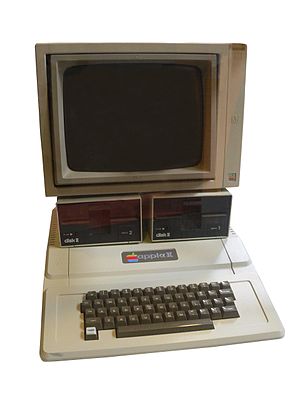
The Apple II (often rendered Apple ][ or Apple //) was one of the first highly successful mass produced microcomputer products, designed primarily by Steve Wozniak, manufactured by Apple Computer (now Apple Inc.)
During 1980 Apple went public. Within a year, the stocks' value increases by 1700%!
Throughout the years, a number of different models were introduced and sold. By the end of its production in 1993, somewhere between five and six million Apple II series computers had been produced.
The Apple II became one of the most recognizable and successful computers during the 1980s and early 1990s. It was aggressively marketed through volume discounts and manufacturing arrangements to educational institutions which resulted in it being the first computer in widespread use in American secondary schools. The computer was especially popular with business users and families.
At the height of its evolution, towards the late 1980s, the platform had the graphical look of a hybrid of the Apple II and Macintosh with the introduction of the Apple IIGS.
Despite the introduction of the Motorola 68000-based Apple Lisa system in 1983, and its more successful cousin the Macintosh in 1984, the relatively unsophisticated Apple II series was Apple's primary revenue source for most of the following decade: with its associated community of third-party developers and retailers it was once a billion-dollar-a-year industry.
The Apple II was designed to look more like a home appliance than a piece of electronic equipment. The lid popped off the beige plastic case without the use of tools, allowing access to the computer's internals, including the motherboard with eight expansion slots, and an array of random access memory (RAM) sockets which could hold up to 48 kilobytes worth of memory chips.
Apple released the Apple IIc in April 1984, billing it as a portable Apple II, because it could be easily carried, though unlike modern portables it lacked a built-in display and battery. The IIc even sported a carrying handle that folded down to prop the machine up into a typing position. It was the first of three Apple II models to be made in the Snow White design language, and the only one that used its unique creamy off-white color.
The next member of the line was the Apple IIGS computer, released in September 15, 1986. A radical departure from the existing Apple II line, the IIGS featured a true 16-bit microprocessor, the 65C816, operating at 2.8 MHz with 24-bit addressing, allowing expansion up to 8 MB of RAM without the bank-switching hassles of the earlier machines (RAM cards with more than 4 MB were never directly supported by Apple). It introduced two completely new graphic modes sporting higher resolutions and a palette of 4,096 colors; however, only 4 (at 640×200 resolution) or 16 (at 320×200 resolution) colors could be used on a single line at a time, although a technique known as dithering was often employed in software to increase the number of perceived colors.
The Apple II series of computers had an enormous impact on the technology industry and on everyday life. The Apple II was the first personal computer many people ever saw, and its price was within the reach of many middle-class families. Its popularity bootstrapped the entire computer game and educational software markets and began the boom in the word processor and computer printer markets
http://en.wikipedia.org/wiki/Apple_II_series
One of the greatest influences on Desktop Publishing was without doubt the ''Emigre Magazine''. It was first published back in the 80's
Emigre was a graphic design magazine published by ''Emigre'' Graphics between ''1984'' and ''2005'' it was first published in 1984 in San Francisco, California, USA. Art-directed by Dutch-born Rudy VanderLans using fonts designed by his wife.., Czechoslovakian-born Zuzana Licko.
Emigre was one of the first publications to use (Macintosh) computers and had a large influence on graphic designers moving into desktop publishing Its variety of layouts, use of guest designers, and opinionated articles also had an effect on other design publications.
The first magazine came out in 1984 with a focus on the émigré. The first eight issues were concerned with boundaries, international culture, travel accounts and alienation (as the issues' titles suggest). The first eight issues also incorporated a dynamic aesthetic that caught the attention of designers and led to the next stage in the magazine's evolution…
http://en.wikipedia.org/wiki/Emigre_%28magazine%29
http://www.emigre.com/index.php
http://designhistorylab.com/?p=1127
http://typophile.com/node/12457
jerome Quinert :)
1980's Sportswear -Rosie
In the 1980s, fashion was influenced by the western economic boom. The dominant market was getting older and was also financially secure. Designer labels and branding gained impetus. Brand names became status symbols especially in the area of for sports gear and sportswear.
By 1979 exercise had become a routine part of many people's lives. Some played squash, others tennis, some jogged, others joined health clubs and took on the whole package. Dance studios with jazz tap exercise and step classes mushroomed. As the craze grew so did a practical need for sports clothes that were up to the task of being easy care for busy people.
Synthetic fabrics with their easy care, strong and often stretch properties were the ideal choice for most sports. Synthetic materials such as licra could also be dyed in strong vibrant colours which were the hallmark of the 80s. Colours were bright and often combined with a contrast secondary colour and white. Typical combinations were navy and white or sea green, sea green and purple, purple and pink, purple and mauve, purple and yellow, peach and sea green, sea green and pastel aqua, royal blue and pale blue, black and white, red black and white or multi computer generated prints of all those colours with just about every colour in the design.
Hip Hop and Sports wear in 1980's
During the 1980s, hip-hop icons began to wear clothing items such as brightly colored name-brand tracksuits, and brand name sneakers usually Pro-Keds, Puma, and Adidas-brand shelltoes. Other clothing brands such as Reebok, Kangol, Champion, Carhartt, and Timberland were very closely associated with the hip hop scene,particularly on the East coast with hip hop acts such as Wu-Tang Clan and Gangstarr sporting the look.
If you look closely at the shoes on the front left hand performer you can make out a air Jordan symbol
Nike
The Nike capture of soon-to-be superstar basketball protege Michael Jordan from rivals Adidas in 1984 proved to be a huge turning point. It launched a massive and very effective advertising campaign and began to dominated the urban streetwear sneaker market in the late 1980s and early 1990s.
www.fashion-era.com/1980s_lifestyle_and_fashion.htm
en.wikipedia.org/wiki/Hip_hop_fashion
sneakernews.com/2009/06/11/michael-jordan-spike-lee-vintage-nikeair-jordan-ads/
www.goarticles.com/cgi-bin/showa.cgi?C=2396781
www.articlesnatch.com/Article/Air-Jordan--Famous-Line-From-Nike/659071
tibor kalman.........(ian)
For a decade he was the design profession’s moral compass and its most fervent provocateur.
The few graphic designers whose accomplishments were legend within the field and widely known outside as well.
Tibor had, by the late 1980s, become known as (or maybe he even dubbed himself) the “bad boy” of graphic design.
Tibor Kalman’s impact could not have been foreseen when he opened M&Co out of his Greenwich Village apartment on the proverbial kitchen table in 1979. Kalman entered the profession through happenstance, bringing with him none of the prejudices of design school training, and little of the expertise. He had a belief that graphic design could provide a stage for his broader concerns. Fusing modernist social responsibility and post-modernist introspection, M&Co developed not only a style but also an ethic that raised the bar of graphic design thinking and practice.
His wife Maira had the nickname “M,” and he called his concern M&Co. Bolstered by an influx of work, Kalman’s sense of the funky and absurd began to kick in. He built “a goofy-looking office, with a goofy, triangular-shaped table that fit into a goofy-shaped conference room.” In the post-modern manner, the office was “very dressed up,” yet the reception window was a hole smashed out of the wall with a sledgehammer. “You could bring a bank client or a rock group there for a meeting,” Kalman explained. “It sort of cut both ways.”
By 1989, Kalman had transformed M&Co’s promotions into a soapbox for arguing the efficacy of social responsibility. “We went along a piece at a time, each time trying to figure out how to make a political children’s toy or how to introduce politics into our products, identity work, corporate work, and music work.”
In 1989, as co-chair with Milton Glaser of the AlGA’s “Dangerous Ideas” conference in San Antonio, he urged designers to question the effects of their work on the environment and refuse to accept any client’s product at face value.
In 1979 Kalman, Carol Bokuniewicz, and Liz Trovato started the design firm M&Co, which did corporate work for such diverse clients as the Limited Corporation, the New Wave music group Talking Heads, and Restaurant Florent in New York City's Meatpacking District.[5] Kalman also worked as creative director of Interview magazine in the early 1990s.
Tibor saw himself as a social activist for whom graphic design was a means of achieving two ends: good design and social responsibility.
“Everyone can hire a good photographer, choose a tasteful typeface and produce a perfect mechanical,” Tibor once railed. “So what? That means ninety-five percent of the work exists on the same professional level, which for me is the same as being mediocre.”
While editing pictures for the photographer Oliviero Toscani, who had created the pictorial advertising identity for Benetton, the Italian clothing manufacturer, Tibor helped produce a series of controversial advertisements focusing on AIDS, racism, refugees, violence, and warfare that carried the Benetton logo but eschewed the fashions it sold.
"He was keenly passionate about things of the American vernacular because he wasn't American," Chee Pearlman, editor of I.D. magazine, remarked shortly after Kalman's funeral. "In that sense, he taught the whole profession to look at things that they may not have seen as closely or taken as seriously." For example, M&Co incorporated images of coffee cups, chairs and delivery trucks culled from the Yellow Pages into a menu Kalman designed in 1985 for Florent, a Manhattan restaurant.
“ We’re not here to help clients eradicate everything of visual interest from the face of the earth. We’re here to make them think about design that’s dangerous and unpredictable. We’re here to inject art into commerce. We’re here to be bad”
-Tibor Kalman and Karrie Jacobs, from Print magazine, Jan/Feb 1990
www.slideshare.net
www.salon.com/people/obit/1999/05/19/kalman
www.aiga.org
en.wikipedia.org/wiki/Tibor_Kalman
www.uic.edu/depts/lib/specialcoll/services/rjd/findingaids/TKalmanf.html
www.adcglobal.org