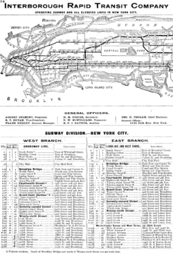
The opening of the first underground subway system in New York in 1904 provided a variety of opportunities for the use of graphic design, and has become a lucrative area for the graphic design industry to work with today.
Then…
The creation of such a complex system required graphic design on many levels. The most immediate graphic design requirements were for the basic informational and directional signage. The station name tablets were composed of small tiles in both serif and sans serif roman capitals. Smaller directional signs were also made in mosaic tile in both serif and sans serif roman capitals.

Graphic design was also required to visually communicate the detailed coding of the subway lines and stations, and this has been updated by designers several times since then. The NY subway also required a level of corporate branding (ie. Logo design, token/ticket design and advertising and promotional materials).


The most ambitious attempt will be digital video ads that play short videos that move across the walls of subway tunnels while the trains are moving through. In addition to the digital ads, there will be more train, pole and surface wrapping with ads as well as large video spots on the walls of busy stations.

http://www.aiga.org/content.cfm/the-mostly-true-story-of-helvetica-and-the-new-york-city-subway:
http://gothamist.com/2007/08/03/michael_hertz_d.php
http://en.wikipedia.org/wiki/New_York_City_Subway
http://www.wired.com/epicenter/2008/10/new-york-subway/#ixzz0lbBAsMOa
Link to New York Transit Museum’s podcast to Learn more about the art, architecture, and history of New York City's subway stations: http://www.transitmuseumeducation.org/museumcast/

well researched and compiled
ReplyDelete