Monday, March 29, 2010

RaY GUn magazine
DAVID CARSON


David Carson was the Art Director of Ray Gun magazine. breaking out from the typical walls of graphic design through Ray Gun. he was self taught and followed his own style to smash restrictive boundaries.
Carson is known best for his work with experimental typography and his cutting-edge magazine design.
ray gun was an American, alternative Rock and Roll magazine. it was first published in California during 1992. David Carson founded the experimental magazine of graphic design. his work with the magazine has him seen to many as one of the most significant graphic designers of the nineties.
his results produced a 'chaotic, abstract style, not always readable but distinctive in appearance'.
davids new direction into design targeted at youth brought him into the eyes of corporate America. large companies such as Nike and Levis saw an opportunity in Davids design to increase youth sales and commissioned him to design prints ads and direct television commercials.
he was so influential to the magazine, his ideology was kept even after David left the magazine.
Ray Gun produced over 60 issues from 1992 to 2000.

http://quazen.com/reference/biography/david-carson/
http://mcharalambous.wordpress.com/2008/04/22/revival-of-the-david-carson-style/
http://www.davidcarsondesign.com/?dcdc=top/n&w=u/a/tsunami
http://www.chapter19.com/biographies/david-carson

5:PENNY Music/Magazines: Stefan Sagmeister


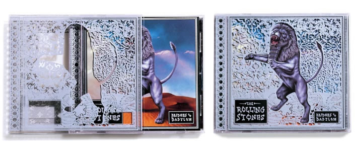
The intent of Stefan Sagmeister in beginning his own Graphic Design company was to allow himself the freedom to design CD covers for the music he appreciated. Over the years, Sagmeister has designed covers, graphics and packaging for musicians such as the Rolling Stones, David Byrne, Lou Reed, Aerosmith, and Pat Metheny. His work in this genre has received four Grammy nominations, and has won many international design awards.


Sagmeister won a Grammy for his work on the Talking Heads collection which features paintings by the Russian contemporary artists Vladimir Dubossarsky and Alexander Vinogradov.


“they contain all of my favourite visual icons: babies bears severed limbs and bare naked people”

Even during Sagmeisters famed year long sabbaticals, he set aside time to design covers.

“The most enjoyable was designing a CD cover every Thursday from 9am to 12pm. I would put any CD that was lying around into the player, start working immediately, and then be done with the whole thing, complete with soft-page booklet and CD label by 12 o'clock.”


Many of Sagmeisters typographical works and experiments have also made their way into magazines and onto posters.
‘Starting A Charity Is Surprisingly Easy’ became the dividing pages opening each new chapter for the Austrian magazine ‘Copy’. Sagmeisters book, ‘Things I Have Learned In My Life So Far’ contains a list of 20 personal quotes, such as ‘Trying To Look Good Limits My Life’ and “Everybody Who Is Honest Is Interesting”, many of these became magazine spreads, billboards, light boxes, annual reports, and fashion brochures.


http://tmagazine.blogs.nytimes.com/2008/02/13/for-the-moment-stefan-sagmeister-3/


http://www.metropolismag.com/story/20080618/brilliant-engaging-but-modest-its-not


http://scene360.com/articles/1186/he-will-make-you-look-an-interview-with-stefan-sagmeister/

http://www.sagmeister.com/sagmeister.html


http://ambidextrousmag.org/issues/10/sagmeister.html
Post 6 | Quote Review - by M'Shell

"Applied good taste is a mark of good citizenship. Ugliness is a form of anarchy…ugly cities, ugly advertising, ugly lives produce bad citizens"


- Lester Beall


The above quote really struck a chord with me at this stage of my life because I feel very interested in good taste, style and all that is visual, and I agree wholeheartedly that ugliness negatively affects citizens. I realise that beauty and ugliness are very subjective ideas, but I propose that, in essence, they are not. Rather, most people can agree that some things are essentially ugly or essentially beautiful.


For example, consider attending a school where all of the classrooms have paint peeling off the walls and the outside of each grey building shows random graffiti (not the artistic kind, the amateur texta-tag kind). There are no trees and no grass, just concrete and dirt. How would you feel about attending school? About learning? About life? Even imagining this sort of ugliness makes me feel trapped, hopeless, angry – emotions that make my life appear to be pointless, not ones that would create good citizens.


The same applies to our current capitalist environment that is filled with advertisements and limitless examples of graphic design in action. If we are going to be surrounded by these examples constantly, those responsible for creating and designing them have an obligation to make them visually appealing.


Every day, good graphic designers enter into a fight – a fight against ugliness. In this way, they seek to creatively contribute to improving the mood and emotions of the masses, making the world a more beautiful place to live.


Shag.


Josh Agle - Poster Designer.

Josh Agle, more commonly known as 'Shag', is an Illustrator, Painter and a Designer in Southern Cali. He initially wanted to become an illustrator-for-hire, but this plan changed when a number of galleries and collectors took a large amount of interest in his work.

Shag has had a number of successful solo exhibitions in Australia, America, Europe and Japan.

The Outré Gallery describes Shag's work as: "The paintings are visually influenced by avant-garde animation of the early fifties and sixties (Terry Toon animated shorts when Gene Deitch headed the studio, Disney's educational short-subjects, beer & cigarette commercials) as well as generic advertising art of the same era (sci-fi pulp art, sixties clip art, etc.). His highly collectable paintings celebrate consumerism through depictions of characters who smoke, drink and socialise in fantasy settings. High profile fans of Shag include Seth Green (Dr Evil's son), Whoopi Goldberg, Ben Stiller, David Arquette who all have Shag originals in their collections."

Shag does the majority in his studio, which overlooks a wooded valley in the hills above L.A. This studio is a part of the home he shares with his family. He is currently in the process of creating a number of works for exhibitions in NY, Paris and Tokyo.


Helpful Shag links:-
x Shag's website
x About the book
x Shag's Wiki
x Earl McGrath Gallery info on Shag
x Outré Gallery

4:PENNY Posters: Audrey Beardsley


"I have one aim—the grotesque. If I am not grotesque I am nothing."

Beardsley was one of the most controversial artists of the Art Nouveau era. He was greatly influenced by Japanese ‘shunga’ and the style’s giant genitalia figured greatly in his later work which often featured grotesque erotica and perverse illustrations.

He was a close friend of Oscar Wilde and illustrated his play ‘Salome’. Among his more famous work is the illustrations for the deluxe edition of Sir Thomas Malory’s, Le Morte d’Arthur.

His work as a Graphic Designer is evident in his work on ‘The Yellow Book’, a magazine at which he was the art editor for the first four editions. ‘The Yellow Book’ was a quarterly literary periodical containing a wide range of literary and artistic material. He was also key in establishing ‘The Savoy’ another magazine of the same style.


He worked in the Arts, creating Posters for theatres, books, plays and magazines; he became a huge influence on the French Symbolists and the Poster Art movement of the 1890’s.


At 25, after a prolific life as an artist, writer and musician, Beardsley died of the tuberculosis which had been slowly killing him since he was a child.


http://www.allposters.com/-st/Aubrey-Beardsley-Posters_c35751_.htm


http://www.artchive.com/artchive/B/beardsley.html


http://www.wormfood.com/savoy/


http://en.wikipedia.org/wiki/Aubrey_Beardsley


http://en.wikipedia.org/wiki/The_Yellow_Book


http://www.all-art.org/symbolism/Beardsley1.html


http://www.britishmuseum.org/explore/highlights/highlight_objects/pd/a/aubrey_beardsley,_self-portrai.aspx

http://ebooks.adelaide.edu.au/b/beardsley/aubrey/art/

POST 6: CIEN: QUOTE

"COMMUNICATION SHOULD BE ENTERTAINING"
- Neville Brody
The reason as to why i chose this quote is it applies to what I think design and communication should be. If something is interesting of course it's going to stick in your mind! It's going to make you think, Hey! I remember that product or advertisement it was funny or entertaining. If somthing is entertaining it's going to make you think about it and talk about it to your friends, therefore from a products point of view there prodcut is getting out there free of charge.
If communication wasn't entertaining, the world would be a boring place!! There wouldn't be a 'pick me up, make me feel good' advertisement to make you feel better on a bad day. There would be no conversation helpers if communication was boring.
When our eye meets a page it wants to be entertained, it wants rythem, it wants to be guided around a page, if everything thing was black and white and in helvetica imagine how 'un'entertaining that would be!!
I strongly agree with this quote as i believe it is 100% true and every designer should stick to it!!

Post 2 -Candy Typography


Paula Scher
Typography

Paula's thoughts and views on Helvetica .

Paula became a designer during the Vietaman War and strongly equates helvetica as fascism, but not the fascism of the 30s and 40s but rather of the 60s and 70s. At the time the Corporate visual language was strongly influenced by Helvetica and all looked similar, they all had that clean look.


The clean look reminder Paula of having to clean her messy room as an adolescent, and thought that it was a conspiracy by her mother to keep her house clean, and that her childhood rebellion was coming back to get her in the form of helvetica. Even though she uses fascism in its childish form doesnt mean she can't connect the font to real world violence.

She was morally opposed to helvetica because she viewed the large corporations overused the typefaces and were sponsors to the Vietnam War. So she believed that if you used the typeface, then you were a supporter of the War. So how could you use it?.
When Paula was asked if Helvetica was the typeface of the Vietnam War?, What is the typeface of "the Iraq war" , she quickly replied with "Helvetica". Helvetica caused it. Paula had rejected Helvetica because of what it had represented to her, her rejection was repeated through architecture, art, film, and literature.

http://starwarsmodern.blogspot.com/2010/03/helvetica-is-fascist.html

www.computerarts.co.uk/in_depth/interviews/paula_scher