Monday, April 26, 2010


KODAK develops color film 16 mm.

Kodachrome is the trademarked brand name of a type of color reversal film that was manufactured by Eastman Kodak from 1935 to 2009.[1] Kodachrome was the first successfully mass-marketed color still film using a subtractive method, in contrast to earlier additive "screenplate" methods such as Autochrome and Dufaycolor, and remained the oldest brand of color film.

Kodachrome is appreciated in the archival and professional market because of its color accuracy and dark-storage longevity. Because of these qualities, Kodachrome is used by professional photographers like Steve McCurry and Alex Webb. McCurry used Kodachrome for his well-known 1984 portrait of Sharbat Gula, the "Afghan Girl" for the National Geographic magazine. It was also used by Walton Sound and Film Services Ltd in the UK in 1953 for the only official 16mm film of the coronation of Her Majesty ''Queen Elizabeth'' the Second. Subsequent prints for sale to the public were also produced using Kodachrome.

As digital photography progressively reduced the demand for film in the first decade of the 21st century, Kodachrome sales steadily declined. On June 22, 2009 Eastman Kodak Co. announced the 'end' of Kodachrome production, citing declining demand.Many Kodak and independent laboratories once processed Kodachrome, but only one Kodak certified facility remains: Dwayne's Photo in Parsons, Kansas, where existing film stock will be developed until the end of 2010.


http://en.wikipedia.org/wiki/Kodachrome

http://creativebleed.com/2009/06/
http://doddcenter.wordpress.com/2009/06/22/kodachrome-no-more/


Jerome Quinert.


HANNAH HOCH


Hannah Hoch was a member of the anarchic and anti-war art Dada Art Movement. Aside from being one of the first women in graphic design, she is also known for being one of the originators of photomontage. Hoch attended the Berlin College or Arts and Crafts and studied glass design and graphic arts. Further, between 1916 and 1926, Höch held down a part-time job in the editorial department of the handiwork division at Ullstein, one of the largest publishing houses in Germany. There she designed fashions, sewing and embroidery patterns, and occasionally penned an article on “domestic arts” topics. She considered this work to be on a par with her fine arts pursuits.

As a member of the Berlin Dada group she was the lone woman and struggled to find acceptance amounts them. Her observations of their hypocritical issues with Gender became rich fodder for her work. She referenced the hypocrisy of the Berlin Dada group and of German Society as a whole in her photomontage, Da-Dandy.

Her most famous piece of art is titled Cut with the Dad Kitchen Knife through the Last Weimar Beer-Belly Cultural Epoch in Germany, pictured below. This piece combines images from newspapers of the time re-created to make a new statement about life and art in the Dada movement. It demonstrates her extraordinary ability to balance many elements in a natural composition, besides being a very early example of a female artist expressing her belief in the power of women. The piece also shows her very Dada biting sarcas that decries ridiculous political personages and controversial policies of the Weimar Republic.


A bisexual, Hoch eroticizes women in many montages but she also poked fun at the way women conformed to men's sexual expectations and to fashion. She gently skewered men, too, by feminizing them: first her fellow Dadaists, in works like ''Da Dandy,'' with its silhouette of a man's head made of pictures clipped from the popular women's illustrated weeklies; then the Nazis, whose pugnacious hero, the boxer Max Schmeling, she deftly parodied in ''The Strong Men,'' its half-male, half-female face plastered across Schmeling's chest.


Like her male colleagues, Höch used the medium of photomontage to comment on the fragmented world of post-WWI Germany. Hers was a less bombastic voice (generally she avoided the addition of type-set slogans) laced with a subtler humor.
Her montages break down what we see and know, and put the fragments back together in a way that makes us question the concepts of identity, culture, and subjectivity.


She flung scale, gravity, continuity, and illusionism around at will. Even her most labor-intensive works manage to look spontaneous and somehow carefree. Even the simplest of her images are built from a complex array of pictorial fragments. Höch loved wild disjunctions of scale, and the juxtaposition of unlikely elements, particularly animals and machines with humans.
And yet, for all their mapcap surface energy, her compositions are for the most part highly unified, their elements anchored by good compositional structure. For the most part, this quality is missing in the male Dadaist montages.

Her montages break down what we see and know, and put the fragments back together in a way that makes us question the concepts of identity, culture, and subjectivity.


http://venetianred.net/2010/01/16/hannah-hoch-the-good-girl-with-big-scissors-part-i/

http://homepage.ntlworld.com/davepalmer/cutandpaste/hoch.htmlhttp://www.artnet.com/magazine_pre2000/features/altstatt/altstatt97-2-13.asp
http://www.nytimes.com/1997/02/28/arts/dada-dearest-an-artist-alone-with-her-calling.html?pagewanted=all
http://en.wikipedia.org/wiki/Hannah_H%C3%B6ch

ROXY: 1920's Cocktails


A Cocktail Bar Poster


Le Sourire, Glamour Erotica Magazine, France, 1920
A poster of women at a cocktail bar


A cocktail book from the 1920's


During Prohibition in the United States (1920–1933), when the sale of alcoholic beverages was illegal, cocktails were still consumed illegally in establishments known as speakeasies. The quality of the alcohol available was far lower than was previously used, and bartenders generally put forth less effort in preparing the cocktails.


Posters for cocktail bars were designed to be sleek and modern using paler colours, round san serif fonts and female flappers.


http://www.postersguide.com/posters/le-sourire-glamour-bars-cocktails-alcohol-evening-dress-cigarettes-smoking-magazine-france-1920-4246271.html

http://www.ssplprints.com/lowres/43/main/3/81727.jpg

http://en.wikipedia.org/wiki/Cocktail

Post 8: CIEN: Charleston 1920'S

The Charleston


- Follow this link to watch Charleston inspired dancing -

The Charleston dance became popular after appearing along with the song, "The Charleston," by James P. Johnson in the Broadway musical Runnin' Wild in 1923.


Although the origins of the dance are obscure, the dance has been traced back to blacks who lived on an island off the coast of Charleston, South Carolina (which is why the dance is called "Charleston"). The Charleston dance had been performed in black communities since 1903, but did not become internationally popular until the musical debuted in 1923.


The dance uses both swaying arms and the fast movement of the feet. To begin the dance, one first moves the right foot back one step and then kicks backwards with the left foot while the right arm moves forward. Then both feet and arms are replaced to the start position and the right foot kicks forwards while the right arm moves backwards. This is done with a little hop in between steps.


The Charleston dance became extremely popular in the 1920s, especially with Flappers. The flappers had a beautiful style that was easier portrayed in posters, as their long dresses created movement to represent the Charleston.


Designers used beautiful elegant posters that were usually bold with one colour and using simple forms or silhouettes to portray the dancers and their movements.

http://history1900s.about.com/od/1920s/qt/charleston.htm

http://www.allposters.com/-st/Dance-Vintage-Art-Posters_c54831_.htm
http://cache2.asset-cache.net/xc/3094148.jpg?v=1&c=IWSAsset&k=2&d=45B0EB3381F7834DF137C24EF26524AB9E4725F583D5137003AA0CF64F13FC89

POST: 1920'S


The 1920's were rich and diverse in graphic art styles- Art Deco, Bauhaus, Constructivism and the beginnings of International style from Switzerland to name a few. Discuss an aspect of graphic design from this decade.

the roaring twenties, flappers, cocktails invented, the jazz age, charleston, new feminism, prohibition of alcohol 18th ammendment, coco chanel, burberry, jaeger, merz magazine, schwitters, million mark note herbert bayer, edward johnston - railway type, quaker oats, a.m.cassandre, bakelite candlestick telephone, philips 2514 radio and speaker, mussolini becomes prime minister of italy, al jolson appears in the jazz singer first full length talking film, kodak developes colour 16mm film, wall street crash, 'vanity fair', paris exposition internationale des arts decoratifs et industriels modernes in 1925, el lissitsky, futurist poster stamp 1931, binder, clarence underwood, raoul dufy textiles, gunta stolzl, neophone 1929, universal font 1925, futura font 1927, offset magazine, paul renner, gills sans 1928, beginnings of jazz, held, malevich, constructivism, "elementare typographie", great gatsby,turkey abolishes arabic alphabet and adopts roman, mah- jongg craze, tutankhamans tomb opened, black friday crash of wall street, bauhaus movement, abstact expressionism, chanel pallette- biege488/taupe4645/ gray warm/black, celery614/pale pink 691/lavender664/powder blue 650 light green 622, art deco bronze 8960/chrome, steel 8002/and glass, bright colours as spot colours,fonts eagle bold, cheltenham, cheltenham bold, kabel black, kabelbook, kabel heavy, kabel light, monotype broadway, ozwald, parsons, futura, erbar, franklin gothic, news gothic, gill sans, coronet

Friday, April 23, 2010

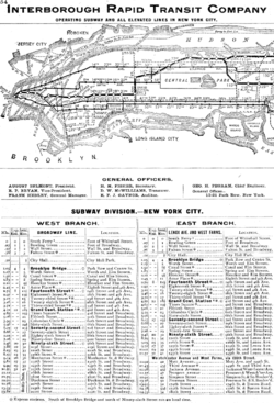
The opening of the New York Subway and its impact on Graphic Design, Then & Now

The opening of the first underground subway system in New York in 1904 provided a variety of opportunities for the use of graphic design, and has become a lucrative area for the graphic design industry to work with today.

Then…

The creation of such a complex system required graphic design on many levels. The most immediate graphic design requirements were for the basic informational and directional signage. The station name tablets were composed of small tiles in both serif and sans serif roman capitals. Smaller directional signs were also made in mosaic tile in both serif and sans serif roman capitals.

Graphic design was also required to visually communicate the detailed coding of the subway lines and stations, and this has been updated by designers several times since then. The NY subway also required a level of corporate branding (ie. Logo design, token/ticket design and advertising and promotional materials).

Now…

Apart from the design of subway maps and signs, the area of the New York Subway that has arguably had the most significant impact on graphic design is advertising. Considering that commuters spend much of their time on the subway, this presents an ideal opportunity for companies to advertise their goods and services to a captured audience.

There are very few subway carriages and stations today that do not have some form of advertising plastered all over them. In fact, in the coming years the New York’s Metropolitan Transportation Authority is announcing plans to cover just about every surface in the subway system with advertising.

The most ambitious attempt will be digital video ads that play short videos that move across the walls of subway tunnels while the trains are moving through. In addition to the digital ads, there will be more train, pole and surface wrapping with ads as well as large video spots on the walls of busy stations.


http://www.aiga.org/content.cfm/the-mostly-true-story-of-helvetica-and-the-new-york-city-subway:

http://gothamist.com/2007/08/03/michael_hertz_d.php

http://en.wikipedia.org/wiki/New_York_City_Subway

http://www.wired.com/epicenter/2008/10/new-york-subway/#ixzz0lbBAsMOa

Link to New York Transit Museum’s podcast to Learn more about the art, architecture, and history of New York City's subway stations: http://www.transitmuseumeducation.org/museumcast/

Thursday, April 22, 2010

Stockholm Olympic Poster - Pam


The first official poster for the promotion of the “Modern” Olympic games was in 1912 for the Stockholm Games held in Sweden. Even though the first official “modern” Olympics was held in Athens in 1896 there was no official poster distributed at that time. Swedish artists and designers, as well as selected artists and designers were nominated by the Olympic Committee and invited to submit their sketches for a competition to win the opportunity of gaining world wide recognition, if successful. Each artist needed to conform strict guidelines for the development of the poster.

In June of 1911 Olle Hjortzberg , was chosen for his poster design, by the Swedish Olympic Committee. The poster represented the march of the nations displaying Olympians waving flags, visually engaging immediate comprehension of the Olympics. Even though Hjortzberg may have abided by the strict guidelines of the brief, the original poster was altered slightly shortly after being selected.

Several participating countries were concerned with the nudity of the athletes, so to please his critiques with the “daring” appearance of his design he added ribbons to disguise the athlete’s nudity. The concept for the nudity was to illustrate reference to the “Games of Antiquity” (nakedness was referred to as a sign of balance and harmony between body and mind). In addition to the official poster design, Hjortzberg was requested to design the Olympic diploma in March of 1912 to be presented to

prize-medal winners of the games. The diploma represents the Goddess Pallas Athene holding staff and the Greek symbol of Victory.


Without the use of today’s communication devices such as radio and television, the poster was the major advertising of the event. It was distributed to 30 countries and therefore printed in over 16 different languages to achieve this. The poster was 75.5cm x 107cm in size and printed in seven colours on velinpaper. With huge demand from the countries the printers were presented with problems

of distributing additional copies in time for the games commencement date not only for the poster but advertising stamp (see pic.), advertising pamphlet and general programme.


http://www.athensinfoguide.com/olympicposterssummer.htm

www.turin2006.com/Documents/Reports/EN/en_report_776.pdf

http://sportsillustrated.cnn.com/vault/article/magazine/MAG1008403/index.htm

http://olympicmuseum.de/poster/poster1912.htm

http://olympic-museum.de/diploma/dipl1912.htm