Friday, April 23, 2010

The opening of the New York Subway and its impact on Graphic Design, Then & Now

The opening of the first underground subway system in New York in 1904 provided a variety of opportunities for the use of graphic design, and has become a lucrative area for the graphic design industry to work with today.

Then…

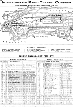
The creation of such a complex system required graphic design on many levels. The most immediate graphic design requirements were for the basic informational and directional signage. The station name tablets were composed of small tiles in both serif and sans serif roman capitals. Smaller directional signs were also made in mosaic tile in both serif and sans serif roman capitals.

Graphic design was also required to visually communicate the detailed coding of the subway lines and stations, and this has been updated by designers several times since then. The NY subway also required a level of corporate branding (ie. Logo design, token/ticket design and advertising and promotional materials).
Now…

Apart from the design of subway maps and signs, the area of the New York Subway that has arguably had the most significant impact on graphic design is advertising. Considering that commuters spend much of their time on the subway, this presents an ideal opportunity for companies to advertise their goods and services to a captured audience.

There are very few subway carriages and stations today that do not have some form of advertising plastered all over them. In fact, in the coming years the New York’s Metropolitan Transportation Authority is announcing plans to cover just about every surface in the subway system with advertising.

The most ambitious attempt will be digital video ads that play short videos that move across the walls of subway tunnels while the trains are moving through. In addition to the digital ads, there will be more train, pole and surface wrapping with ads as well as large video spots on the walls of busy stations.


http://www.aiga.org/content.cfm/the-mostly-true-story-of-helvetica-and-the-new-york-city-subway:

http://gothamist.com/2007/08/03/michael_hertz_d.php

http://en.wikipedia.org/wiki/New_York_City_Subway

http://www.wired.com/epicenter/2008/10/new-york-subway/#ixzz0lbBAsMOa

Link to New York Transit Museum’s podcast to Learn more about the art, architecture, and history of New York City's subway stations: http://www.transitmuseumeducation.org/museumcast/

Thursday, April 22, 2010

Stockholm Olympic Poster - Pam


The first official poster for the promotion of the “Modern” Olympic games was in 1912 for the Stockholm Games held in Sweden. Even though the first official “modern” Olympics was held in Athens in 1896 there was no official poster distributed at that time. Swedish artists and designers, as well as selected artists and designers were nominated by the Olympic Committee and invited to submit their sketches for a competition to win the opportunity of gaining world wide recognition, if successful. Each artist needed to conform strict guidelines for the development of the poster.

In June of 1911 Olle Hjortzberg , was chosen for his poster design, by the Swedish Olympic Committee. The poster represented the march of the nations displaying Olympians waving flags, visually engaging immediate comprehension of the Olympics. Even though Hjortzberg may have abided by the strict guidelines of the brief, the original poster was altered slightly shortly after being selected.

Several participating countries were concerned with the nudity of the athletes, so to please his critiques with the “daring” appearance of his design he added ribbons to disguise the athlete’s nudity. The concept for the nudity was to illustrate reference to the “Games of Antiquity” (nakedness was referred to as a sign of balance and harmony between body and mind). In addition to the official poster design, Hjortzberg was requested to design the Olympic diploma in March of 1912 to be presented to

prize-medal winners of the games. The diploma represents the Goddess Pallas Athene holding staff and the Greek symbol of Victory.


Without the use of today’s communication devices such as radio and television, the poster was the major advertising of the event. It was distributed to 30 countries and therefore printed in over 16 different languages to achieve this. The poster was 75.5cm x 107cm in size and printed in seven colours on velinpaper. With huge demand from the countries the printers were presented with problems

of distributing additional copies in time for the games commencement date not only for the poster but advertising stamp (see pic.), advertising pamphlet and general programme.


http://www.athensinfoguide.com/olympicposterssummer.htm

www.turin2006.com/Documents/Reports/EN/en_report_776.pdf

http://sportsillustrated.cnn.com/vault/article/magazine/MAG1008403/index.htm

http://olympicmuseum.de/poster/poster1912.htm

http://olympic-museum.de/diploma/dipl1912.htm

Tuesday, April 20, 2010

the electric light bulb

The first electric light was made in 1800, by Humphrey Davy. Edison didn't invent the light bulb‚ but his improvements on it made it commercial.
Employing electric bulbs as decoration both continued existing traditions of employing festive lighting for occasions of significance, and expanded upon the more particular practice of strings of electric bulbs as seen at the World's Fairs and International Expositions throughout the 1880s.
Modern advertising practices actually share a lot in common with one of the very first mergers of technology, advertising and spectacle: the electric bulb advertising signs which loomed large over Broadway more than 100 years ago.

cinema marquees

San Francisco's 'California', London's 'Savoy' and Boston's 'Bijou' theatres all had converted to electrical lighting throughout by 1882. From its adoption within the interior theatre space, electric bulb lighting quickly spread to the facades of theatres, as well; the New York theatre owner Adolf Zukor, for one, used approximately one thousand bulbs above his theatre to spell out 'Crystal Palace'. In competition for the same theatregoers and eyeballs, other theatres rapidly followed suit.

outdoor advertisments

In 1891, New York's Madison Square was host to a large flashing bulb sign fifty feet tall and eighty feet wide imploring viewers to "See the Turtle a Snapping Success". In July 1892, Manhattanites in the vicinity of Fifth Avenue and Broadway between dusk and midnight were
greeted by the following sequential messages blinking at them in green, red, yellow and white lights from the side of a building “BUY HOMES ON/LONG ISLAND/SWEPT BY OCEAN
BREEZES/MANHATTAN BEACH/ORIENTAL HOTEL/MANHATTAN
HOTEL/GILMORE’S BAND/BROCK’S RESTAURANT”.

The first advertising electric bulb sign appeared in Manhattan in 1892 and stylistically
mimicked existing print advertising conventions. Over time, however, the sign developed
its own unique style of visual iconography shaped in part by the limited representational capacity of the sign itself and its commercial message.

AEG
The AEG logos above show a change in style, from the end of the victorian age,1896, to the highly stylised art nouveau logo, by Otto Eckerman, at the turn of the century. The next four are by Peter Behrens, from 1907 to 1912.


TiffanyLamp
The first Tiffany lamp was created around 1895. Beautiful in design and intricacy, each lamp was handmade by skilled craftsman, not mass or machine produced. Its designer was not, as had been thought for over 100 years, Louis Comfort Tiffany, but an unrecognized single woman named Clara Driscoll. Art Nouveau was a reaction to academic art of the 19th century, it is characterized by organic, especially floral and other plant-inspired motifs, as well as highly-stylized, flowing curvilinear forms.

Monday, April 19, 2010


W
illiam Morris
William Morris William Morris William Morris


''William Morris'' patterns have been popular since the end of the 19th century and have never lost their appeal. With Dante Gabriel Rossetti, Arthur Hughes, his lifelong friend, Edward Burne-Jones, and the other pre Raphaelites, he changed the direction of English art, architecture, and design -- and began a return to values of craftsmanship and quality materials that continue to enjoy a renaissance in these areas.''


''William Morris'' 24 March 1834 to 3 October 1896) was an English textile designer, artist, writer,and socialist associated with the ''Pre Raphaelite'' Brotherhood and the English Arts and Crafts Movement.

Morris wrote and published poetry, fiction, and translations of ancient and medieval texts throughout his life. His best-known works include The Defence of Guenevere and Other Poems , The Earthly Paradise, A Dream of John Ball and the utopian News from Nowhere

He was an important figure in the emergence of socialism in Britain, founding the Socialist League in 1884, but breaking with the movement over goals and methods by the end of that decade.

He devoted much of the rest of his life to the Kelmscott Press, which he founded in 1891. The 1896 Kelmscott edition of the Works of Geoffrey Chaucer is considered a masterpiece of book design.

Born in Walthamstow in East London, Morris was educated at Marlborough and Exeter College, Oxford. In 1856, he became an apprentice to Gothic revival architect G. E. Street. That same year he founded the Oxford and Cambridge Magazine, an outlet for his poetry and a forum for development of his theories of hand-craftsmanship in the decorative arts.

In 1861, Morris founded a design firm in partnership with the artist Edward Burne-Jones, and the poet and artist Dante Gabriel Rossetti which profoundly influenced the decoration of churches and houses into the early 20th century. His chief contribution to the arts was as a designer of repeating patterns for wallpapers and textiles, many based on a close observation of nature. He was also a major contributor to the resurgence of traditional textile arts and methods of production.


Links

http://en.wikipedia.org/wiki/William_Morris

http://www.tech-news.com/another/ap200807.html

http://bestoflegends.org/poets/index.html

http://chestofbooks.com/crafts/needlework/A-Book-About-Embroidery/Darning.html

Jerome Quinert.


ROXY: Multiplex Typewriter

"The typewriter symbolized the golden age of writing in the last century. It not only helped produce great literature, but often became part of the story itself."


Since 1867 typewriters have been used for creating visual art. The earliest preserved example of typewriter art was made in 1898 by a woman named Flora Stacey. Not much is known about Flora Stacey except that she was probably a secretary. Her framed picture of a butterfly was published in the October 15th, 1898, edition of Pitman's Phonetic Journal.
The entire rendering of this picture was created with the typewriter -- yes, even the butterfly! The butterfly is composed of brackets, hyphens, points, oblique strokes, a single asterisk, and several "o"s.


Today, typewriter fonts are used to give an older feel to a design.


- E. E. Cummings used the typewriter to change the design (layout) of the words in his poems to give time poetic effect. His grasshopper poem is perhaps the most famous example.

e. e. cummings poem, "Grasshopper"

- When Remington first started marketing typewriters in the 1910's, the company assumed the machine would not be used for composing but for transcribing dictation, and that the person typing would be a woman. Flowers were printed on the casing of early models to make the machine seem more comfortable for women to use.

A 1910's ad for typewriters


- The first monospaced typefaces were designed for typewriters, which could only move the same distance forward with each letter typed.


http://cd.textfiles.com/darkdomain/www/mirrors/jgs/History_of_ASCII_-_Joan_Stark.html

jugentstil


Art nouveau french pronunciation is an international movement and style of art, architecture and applied art—especially the decorative arts—that peaked in popularity at the turn of the 20th century (1890–1905).[3] The name 'Art nouveau' is French for 'new art'. It is also known as Jugendstil, German for 'youth style', named after the magazine Jugend,


which promoted it, and in Italy, Stile Liberty from the department store in London, Liberty & Co., which popularized the style. A reaction to academic art of the 19th century, it is characterized by organic, especially floral and other plant-inspired motifs, as well as highly-stylized, flowing curvilinear forms. Art Nouveau is an approach to design according to which artists should work on everything
from architecture to furniture, making art part of everyday life.


Jugenstil poster designers in Berlin included Paul Scheurich, Edmund Edel, Hans Rudi Erdt, Lucian Bernhard, Julius Klinger, Julius Gipkens, Jupp, Wiertz and Joseph Steiner. Many of these artists were still dominating the scene in the 1920s. Some of the posters designed in Austria and Germany at the turn of the century tended, in style, towards a form of Expressionist realism, while retaining a strong link with the decorative motifs of Jugcndstil. After 1900 the floral decorations as a dominant motif gave way to a more abstract design.


The first golden age of graphics arrives before World War I, characterized by the so-called Sachplakat (‘object poster’ or ‘objective poster’), a new approach different from that of ‘painting-like’ posters. Berlin, with artists such as Lucian Bernhard and Julius Klinger, stands at the center of this movement. Bernhard in particular, as the flag-bearer of the Sachplakat, breaks down advertisement posters into three parts—image, background, and text—, creating an entirely new format that allows posters not only to be aesthetically pleasing but also to transmit information instantaneously. An example representative of his work is the posterdesigned for Stiller, a footwear outlet, in 1908.
The poster, a new art field, also makes ties with commerce and rapidly broadens its base. Passionate collectors emerge, including Hans Sachs of Berlin who founds the Verein der Plakatfreunde in 1905 and issues the magazine Das Plakat, contributing to the popularization of this newly-arisen art form.

http://www.jugendmagazine.net/
www.fontcraft.com/ fontcraft/?p=442

http://www.allposters.com/-st/Lucian-Bernhard-Posters_c38832_.htm


http://andywallman.wordpress.com/2010/02/20/plakatstil-early-1900s-german-poster-style/


http://en.wikipedia.org/wiki/Art_Nouveau

Post 7. CIEN. WW1 propaganda posters


World War 1
Propaganda Posters

Each nation that was involved in World War 1 used propaganda posters to inform, and spread the hype the war. They almost 'pressured' men into joining. The used women on posters, men in pain that needed help, they made it look like an adventure which appealed to so many men.


Yet while the use of posters proved initially successful in Britain the numbers required for active service at the Front were such as to ultimately require the introduction of conscription. Nevertheless recruitment posters remained in use for the duration of the war - as was indeed the case in most other countries including France, Germany and Italy.

However wartime posters were not wholly used to recruit men to the military cause. Posters commonly urged wartime thrift, and were vocal in seeking funds from the general public via subscription to various war bond schemes (usually with great success).

Interestingly, for all that the U.S.A. joined the war relatively late - April 1917 - she produced many more propaganda posters than any other single nation.

Australia entered the First World War along with Britain in August 1914.

The government was not slow however in attempting to stimulate recruitment in a country where conscription was forbidden.

In addition to posters the government dispatched specially inscribed postcards (e.g. 'Hasten!', 'Hurry!') to the homes of men who had not enlisted to date.

Follow these links to see each countries posters

Australia

Belgium

Canada

France

Germany

Italy

Russia

UK